Today, I was in my studio for the first time in over 3 months! Boy, it's been a crazy time in my life. But after picking up some of the holiday present mess I left, after dusting things off, and after putting away some treasures I've purchased in these last few months, I was raring to go!
I'm really pleased to share that I drafted the design for my public art project I'm going to reveal in Seattle in a couple of weeks.
I've had this idea for a while to do a public art project. My concept was to create small pieces of art that I would distribute in a geographic area. I wanted to surprise people when they realized that they just found a piece of art. As a double surprise, I wanted it to contain an inspiring message, almost like a great fortune cookie. My idea is that someone randomly would find one of my pieces, be inspired, and take it home. Or give it away.
I'm going to Seattle for business in just a few days now, and I had begun to think I wasn't going to have time to do this project. But getting a prototype drafted is a huge step. Perhaps I won't have as many finished I was hoping, but I do believe I will be taking some with me to Seattle.
I decided this afternoon to skip the anonymous part of my idea. I'm going to put a website and a serial number on each piece of art, and have the web address take people to a specific post on this blog. I hope they will add a comment to the blog post including their art piece number, and a little bit of their story. I'm very excited to get a chance to hear back from people about this project. I had thought about launching a whole website, keeping it anonymous, but I just don't have the time to handle all of that right now. Maybe in the future.
So it's part art project, part sociology experiment, and a whole lot of fun for me. I hope you stick around to see what happens, too.

Showing posts with label project. Show all posts
Showing posts with label project. Show all posts
Thursday, March 19, 2009

Saturday, December 20, 2008
San Francisco Travel Memory Book

I'm too tired tonight to start the next project, so I decided I would blog this one and then hit the bed. I've already triaged my holiday gifts, and I'm going to call people tomorrow and explain that I don't have their gift done, but will finish it after I return to Phoenix. I'm sorry it has come to that, but I won't drive myself crazy to finish projects when I know people won't mind at all.
So, here is the second finished holiday gift for my family. This one is for my sister. She visited San Francisco this year, and hasn't done anything with her photos. I've made this book using a combination of travel guide pages, scrapbook papers, and photographs (reduced in size to act as embellishments). She can add 12 of her favorite pictures into this book.
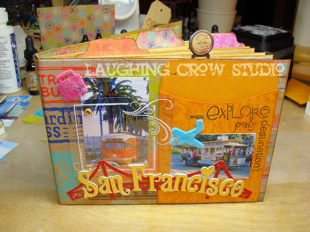
This book doesn't have much dimension on the cover, but I did add a few layers. Notice the screen over the cable car picture (white scroll box) attached with an eyelet. I'm going to make a tag book to go inside the library pocket on the right (Bazzill).

As usual, I've added tags and tabs and clips along the outer edges of the pages along the top and side. I love the way this adds dimension to the book. I really love the grungy, distressed character of the paper, and have used the Tim Holtz distress inks to add to that feeling. The brown is Brushed Corduroy, and I've used it everywhere. I used a stamp to make the tabs out of the remnants of the scrapbook paper series.
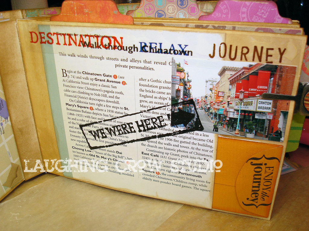
Here's a page based on a travel guide page. I've used the description of Chinatown along with a reduced photograph from Chinatown, and added a small coin envelope (Bazzill) so she can tuck away a small treasure or two. I used Stazon ink to stamp over the glossy travel guide page and photograph.
There are more pictures on Flickr.

Thursday, December 18, 2008
Holiday Gift Tags

I'm so excited to share these with you! These are my holiday gift tags this year. I normally make nice tags, but I decided to go all out this year. This is my first holidays with my studio, and it is the best present I have ever given myself! Here's some of the back story on how I made these tags.
[Ooopps. I guess Jamie and Tyson now know they are getting something from me! Maybe I should have posted a spoiler alert.]
First, I pulled out everything I could think of related to a holiday theme from my stamp collection. I ended up going with a star theme because I have a nice star quote stamp. It speaks to the holidays without specifically being about Christmas or any specific holiday.
Then, I spent about an hour designing and mocking up a tag. I focused on placement and layout, and once I had it the way I liked it, I started thinking about the colors. My inspiration for the colors was a ball of recycled silk yarn from Tibet. I love this stuff, and want to use it where it has a big impact. I pulled colors from this to select which of my Tim Holtz Distress inks I would use. Because I love green and all shades of blue-green, that's my main color. The red really contrasts nicely with the coolness of the blues and greens. I wasn't thinking Christmas when I picked this scheme, but it works.
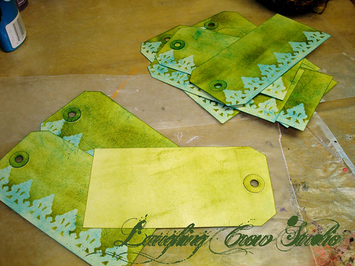
I started by using the applicator to put a background coat of Broken China (blue) on each tag. Next, I used one of the Tim Holtz masks along the left border and applied a coat of Peeled Paint (green) with the applicator. I turned each card over and lightly covered the back. I really hate raw surfaces in my projects.
As you can see, I went through a learning curve with the ink and applicator. After a few tags, I figured out that rubbing the applicator over the ink pad and then rubbing it over the tag gives the best color coat without applicator sized blotches. That's what I love about my art right now, I'm starting to master tools because I'm using them more often.
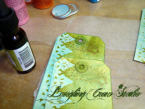
I added a shooting star stamp across the top of the tag over the hole. I tried using silver because I thought it would go nicely with the aluminum ring around the circle tag, but in the end, I went with copper. The copper blends into the background colors and I liked that look better than the shiny look of the silver.

I started adding content from the bottom, starting with the year. I love the way this Fired Brick red contrasts with the cool blue green background.
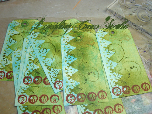
While playing around with the prototype, I decided that I wanted some sort of scrolling image in the middle of the tag, but subtle so it doesn't make it hard to read the quote. I tried several scrolls, but ended up with this one because it is light handed. I used the Pine Needles ink for this, which is more of an olive, yellow green. I love using adjacent colors on the color wheel like this because I love the richness it adds to the palette.

I used the Fired Brick again on the quote to make this the most prominent part of the design. It took a bit to figure out the placement for the stamp so I had the words in the best location. It was fun watching them suddenly appear nearly finished on the table.
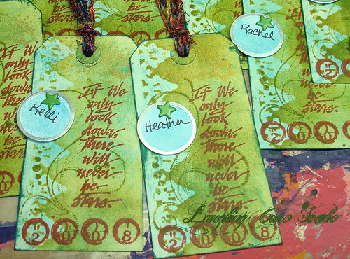
I finished up the inking by using Pine Needles on the edges and doing a bit of distressing on top and bottom. I love the distressed grunge feel it gives. I wrote the recipient names on the circle tags, and using a paper piercers, I punched a hole and inserted a star brad to attach the circle tag to the gift tag. I noticed that the circle repeats the scrolling design underneath, and love the way it lines up with the scrolls. I wish I could say I planned that, but in truth, it was a happy accident.
I cut the yarn and attached them to the tags. They are so pretty I keep one near me when I'm at the computer just to cheer me up!
More pictures on Flickr.
Saturday, November 15, 2008
Project: Accordion Book with Tag Book

I had a blast making this gift. First, the people receiving it have been kind to me at a time when I was struggling, and I appreciate that kindness. But building on what I've been making, and taking it to the next level, was such a stretch. It's an amazing thing to watch myself build skills in both design and execution. I'm really proud of everything I've made this year, but I feel this one is the one where the design I see in my head is very nearly the design I hold in my hand. I'm closing that gap (even as the designs in my head get better and more complex).

This is another accordion book that open both from the top and the bottom. I put a 7 Gypsies book belt on this one to hold the contents together. It's slightly off center, and I laid out the cover to accommodate this element. The cover contains two photographs trimmed down and distressed. The Bazzill library pocket is stamped with a Tim Holtz stamp using Peeled Paint Distress Ink. The pocket holds a tag mini-book (see later photo for details) with various ribbon, yarn, and a few Tim Holtz distress elements danglies. The ribbon across the bottom wraps around the front cover, and holds the paper flower with a crystal brad. I used Glimmer Mist (Patina and Coffee Shop) on the paper flower to make it blend in a bit more with the cover elements. A stamp, a compass, and a Chinese coin round out the cover.

The tag book is made from manilla tags that I've sprayed with Glimmer Mist (Patina and Key Lime Green) and then stamped with various stamps using Tim Holtz Distress Ink in Peeled Paint. They are stamped on one side and have Glimmer Mist on the back side. My thinking is that they can add pictures on the stamped side and write on the back. The tags are bound with a ball chain (which I trimmed down) and adorned with yarns and ribbons and danglies. I tried to make this gender neutral, but I couldn't help myself with the yarns. There are six tags in this book.
The interior pages I used Glimmer Mist (Patina and Robin's Egg in one direction, Patina and Coffee Shop in the other) using Tim Holtz masks with the clock face and gears. I added tabs and other page marking items. When you open the book from the top, it contains a photo holder that I also distressed and painted with Glimmer Mist so it blends into the rest of the project.
More pictures available on Flickr.
Project code: 280111
Thursday, November 6, 2008
Project: Photo Accordion Book

Tonight, I gave a gift book to a very dear new friend. I decided over the weekend that I would make a small book for her. So I spent some time going through her Flickr archive looking for a photo I could use for the cover. It turned out, she has quite a collection of photos out there, and so I decided to print several pictures for her book.
Note: I was able to do this because my friend had not copyright protected her images on Flickr. If she had protected them, I would have needed her permission to use them, even in a gift for her. I would have taken that step, even though it would have removed most of the surprise of the gift.
I decided to use an accordion book. I assembled the book so it opens from both the bottom and the top. Before assembling the book, I decided that I would leave the book mostly blank for her to put in her pictures. Because she would be adding photos, I needed an artistic design for the inner pages that I could do, rather than embellishments added on top of photos. I decided to use Glimmer Mist and a Heidi Swap mask. Using three colors (Patina, Robin's Egg Blue, and Key Lime Green), I misted the backgrounds on both sides. I used papertowels to cover up pages that I didn't want to mist in each section. I made some more green and some more blue, mostly by the color I put on the top.
 While the inner pages dried, I covered the covers with Bo Bunny striped paper, and then assembled the front decorations. I did a dry layout and used my digital camera to snap the planned layout for later. I went through my stash, and used some elephant stamps, a small compass, the word "journey," and a lot of flowers. I used a Tim Holtz ATC stamp to add some interest to the Bazzill library pocket. I used Peeled Paint distress ink to stamp the library pocket, and a series of green cateye chalks to distress the edges of things on the cover.
Next, I assembled the book, using a UHU glue stick to assemble the pages to the covers. I closed the book, and put it under something heavy in my office for an hour to make sure it was solid before moving forward. I added a few photos to the interior before I assembled the front cover. After the cover was finished, I went through and added tabs to many of the interior pages. As a last step, I used a small photo folder and attached it in the middle from the top, and inserted the remaining photos in it.

When I was finished, about an hour later (not counting drying time), I had a lovely gift I was proud to give. Total cost was under $10. My friend can use a Sharpie or a pigment ink pen to write captions on and around her photos after she assembled the whole album.
More pictures available on Flickr.
Project code: 280011
Monday, July 21, 2008
Santa Fe Destination Forms
I've finished the Santa Fe Travel Journal and it is ready to hit the road with me. Yesterday, I printed out the destination forms, one each for places to eat, museums/parks, and shopping spots. I spent some quality time pouring over my new travel guide to select the possible destinations, filled out the appropriate form, and add the location to my GPS favorites. From that standpoint, I'm ready to leave!

One thing that surprised me was the number of forms I needed. To start out, I printed 10 of each form. I'm only going to have three days in Santa Fe, so I thought that would be more than enough. I ended up printing more of each form! I realized that I was filling out forms for all of the possibilities, the places I would like to see, and not just the ones I've decided to see. That rather fits my personality. I like the idea of having a pool of places to choose from, and will make my choices depending on my mood, the distance to the place, and how my trip is going. For example, on the third day, if I have eaten nothing but excellent Mexican/southwestern cuisine, I might be more in the mood for the cute French bistro.
As a result, I ended up using all of the envelopes that make up the honeycomb for the forms. I have one for each type of destination, and one with the remaining blank forms that I can use for places I discover en route. I'm taking my red Sharpie along. The red stands out nicely from the paper and matches the journal. I might even pick up another one to stash in the glove box, just in case.
I had planned to distress the edges and bind them with a book ring. But once I saw the quantity of forms, I decided not to distress and realized that having so many book rings would add bulk. The forms fit perfectly into the envelopes. They are filed away safely, and they will be easy to go through, also.
I found a few tweaks to make to the forms as I started filling them out. I didn't take the time to make them now, but will make all of my improvements when I get back. I'm sure I will have more ideas after I've filled them out completely.
I'm very excited. Not only do I have this cute travel journal for the trip, but the forms help me to feel very prepared to cherry pick the best destinations while I wander. And I'll have a record of the shop names and addresses, the meals I ate, and the sights to use on my next trip or to share with people who ask me for a recommendation.

One thing that surprised me was the number of forms I needed. To start out, I printed 10 of each form. I'm only going to have three days in Santa Fe, so I thought that would be more than enough. I ended up printing more of each form! I realized that I was filling out forms for all of the possibilities, the places I would like to see, and not just the ones I've decided to see. That rather fits my personality. I like the idea of having a pool of places to choose from, and will make my choices depending on my mood, the distance to the place, and how my trip is going. For example, on the third day, if I have eaten nothing but excellent Mexican/southwestern cuisine, I might be more in the mood for the cute French bistro.
As a result, I ended up using all of the envelopes that make up the honeycomb for the forms. I have one for each type of destination, and one with the remaining blank forms that I can use for places I discover en route. I'm taking my red Sharpie along. The red stands out nicely from the paper and matches the journal. I might even pick up another one to stash in the glove box, just in case.
I had planned to distress the edges and bind them with a book ring. But once I saw the quantity of forms, I decided not to distress and realized that having so many book rings would add bulk. The forms fit perfectly into the envelopes. They are filed away safely, and they will be easy to go through, also.
I found a few tweaks to make to the forms as I started filling them out. I didn't take the time to make them now, but will make all of my improvements when I get back. I'm sure I will have more ideas after I've filled them out completely.
I'm very excited. Not only do I have this cute travel journal for the trip, but the forms help me to feel very prepared to cherry pick the best destinations while I wander. And I'll have a record of the shop names and addresses, the meals I ate, and the sights to use on my next trip or to share with people who ask me for a recommendation.
Sunday, July 20, 2008
Lightening Strikes
I'm so excited that I have to post again here. I've just spent the first part of my evening reviewing a travel guide to make a list of the places to see, shops, and restaurants I want to visit on my trip. Unable to sleep (that's another story), I began mapping out form I could make to organize and record that basics for these destinations that would allow me to journal about them and add photos later (for the ones I really visit). I had the idea of printing a basic information collection form on tags that would allow me the room to hand write my notes, bind them with a book ring, and then pull them out when I arrive.
The tag idea had two limitations. First, the tags I was imagining were too small for the generous envelopes that make up the honeycomb book. The ribbons will hold loose items, but only if they approximately fit the slots. Second, the tags didn't have enough room to paste in the info from the travel guide and a photo. So I was rethinking what I wanted.
Then I had a brain storm and lightening struck!
I just spent the last 2 hours designing three forms (restaurants, shops, galleries/parks) that organize the relevant information about each. The restaurant form even collects information about which meals they serve and recommendations of must-try menu items. They all collect information about what I would do differently if I returned in the future as part of the journaling.
I've just printed out the drafts, and after I make some tweeks, I'll be printing out multiple copies of each form on plain cardstock, distressing the edges, punching a binding hole, and slipping them into one of the honeycombs. I'll spend some time with the travel guide before I leave to fill them out.
I'm so excited to have a challenge and find a solution in time to take the journal with me on the trip! Now that lightening has struck, maybe I can win the lottery, too.
The tag idea had two limitations. First, the tags I was imagining were too small for the generous envelopes that make up the honeycomb book. The ribbons will hold loose items, but only if they approximately fit the slots. Second, the tags didn't have enough room to paste in the info from the travel guide and a photo. So I was rethinking what I wanted.
Then I had a brain storm and lightening struck!
I just spent the last 2 hours designing three forms (restaurants, shops, galleries/parks) that organize the relevant information about each. The restaurant form even collects information about which meals they serve and recommendations of must-try menu items. They all collect information about what I would do differently if I returned in the future as part of the journaling.
I've just printed out the drafts, and after I make some tweeks, I'll be printing out multiple copies of each form on plain cardstock, distressing the edges, punching a binding hole, and slipping them into one of the honeycombs. I'll spend some time with the travel guide before I leave to fill them out.
I'm so excited to have a challenge and find a solution in time to take the journal with me on the trip! Now that lightening has struck, maybe I can win the lottery, too.
Saturday, July 19, 2008
Depth of Experience
On Friday, I once again treated myself to a wonderful Carol Wingert class at Scrapbooks, Etc. This time, we made Carol's Dos-a-dos travel journal, a project she has taught a couple other times this summer. It's a fun red and black multiple part book. The front is an envelope/honeycomb book assembled with envelopes between the front and back covers. And the back is a another book, one with a sewn signature that opens from the back. When you look down from the top, the two books (joined at the back) make a Z shape.

I made a few changes to the covers. Carol used the same two papers on each front cover, and I used one paper on one cover and the other paper on the other cover. Inspired by classmate Marissa, I overstamped both papers with the assortment of travel stamps Carol provided. I love the way this adds another layer of interest to the covers. Oh, and don't miss the fun clipboard on the front cover (see Carol's picture).

In this picture of the back book cover, the paper background is tan and it has a swirling floral pattern. The word "travel" in the upper right corner (under the bird) is stamped, so are the names of the days of the week below that.
I nearly finished the embellishments in the class, and I'm working on this today because I am taking it with me next week to Santa Fe. I've decided that I need a change of scenery and since I visited the ocean in February, I'm heading for the high desert. I've been to Santa Fe more than a dozen times before, but it's been at least 10 years since my last trip. I'm very excited to visit all of my old favorites and discover some new ones.
I've actually had some difficulty deciding to take this trip. As I figured up the cost, I realized the fun things I could buy with the money and stay home. I have always been that practical about money, but in the past, I found it very easy to justify buying experiences over objects. It's only been the last 10 years or so that I've been more focused on having something to show for my expenditures. I'm not sure where that came from, but now that I see it clearly, I recognize it is a weed in my garden and I know it has been choking my growth a bit.
From my youth, I've been a person who wanted to experience as much of the world and as many different ways of living as I could fit into my life. I have always valued quality over quantity, and so I've avoided having the same experiences over and over (quantity). I've also chosen to avoid the path of the crowd, so I'm not a fan of shopping malls and I don't see all of the popular movies and listen to the hit radio stations. I seek out other things, art house and independent movies, world music, small import shops over big box retail, and documentaries on TV rather than prime-time series. I feel this gives me a richer life, and more texture in my thoughts than what is available through the mass consciousness. I haven't seen a single Seinfeld episode (and hence miss the references to that experience in the collective consciousness), but I know more than a little bit about art history and I've seen landscapes from most of the countries of the world (through photographs). I've experienced the prayer practices of several faiths, and love to chat with people from other places about their homelands.
It's not the life that most people want, but for me, it feeds my thinking and feeling, and nurtures my writing and my art.

I made a few changes to the covers. Carol used the same two papers on each front cover, and I used one paper on one cover and the other paper on the other cover. Inspired by classmate Marissa, I overstamped both papers with the assortment of travel stamps Carol provided. I love the way this adds another layer of interest to the covers. Oh, and don't miss the fun clipboard on the front cover (see Carol's picture).

In this picture of the back book cover, the paper background is tan and it has a swirling floral pattern. The word "travel" in the upper right corner (under the bird) is stamped, so are the names of the days of the week below that.
I nearly finished the embellishments in the class, and I'm working on this today because I am taking it with me next week to Santa Fe. I've decided that I need a change of scenery and since I visited the ocean in February, I'm heading for the high desert. I've been to Santa Fe more than a dozen times before, but it's been at least 10 years since my last trip. I'm very excited to visit all of my old favorites and discover some new ones.
I've actually had some difficulty deciding to take this trip. As I figured up the cost, I realized the fun things I could buy with the money and stay home. I have always been that practical about money, but in the past, I found it very easy to justify buying experiences over objects. It's only been the last 10 years or so that I've been more focused on having something to show for my expenditures. I'm not sure where that came from, but now that I see it clearly, I recognize it is a weed in my garden and I know it has been choking my growth a bit.
From my youth, I've been a person who wanted to experience as much of the world and as many different ways of living as I could fit into my life. I have always valued quality over quantity, and so I've avoided having the same experiences over and over (quantity). I've also chosen to avoid the path of the crowd, so I'm not a fan of shopping malls and I don't see all of the popular movies and listen to the hit radio stations. I seek out other things, art house and independent movies, world music, small import shops over big box retail, and documentaries on TV rather than prime-time series. I feel this gives me a richer life, and more texture in my thoughts than what is available through the mass consciousness. I haven't seen a single Seinfeld episode (and hence miss the references to that experience in the collective consciousness), but I know more than a little bit about art history and I've seen landscapes from most of the countries of the world (through photographs). I've experienced the prayer practices of several faiths, and love to chat with people from other places about their homelands.
It's not the life that most people want, but for me, it feeds my thinking and feeling, and nurtures my writing and my art.
Saturday, July 5, 2008
Project Update: Guitar Hero
I have spent several precious hours tonight in the studio. After a little bit of picking up, I pulled out the Guitar Hero project and continued where I left off. [This is an accordian/exploding book.]I believe I have about 70% of the pictures cut and temporarily attached in their final locations. I have pictures on the front and back, when I had only planned to cover the front. But as I went through the pictures, I found people who were missing from the existing photos, and I wanted to make sure the project documents Kyle's special night. So I expanded to the back.
I used the Tim Holtz distress inks in Scattered Straw, Aged Mahogany, and Milled Lavender, but very little of the lavender. I've inked some tags, some metal rimmed tags, and some cardstock pieces for journaling. I used a combination of round and square stamps on the tags and attached them with eyelets in an old gold color. I used black craft foam cut into strips to raise up some photos so I can add journalling behind some of the pictures. I'm about half way through attaching the photos and embellishing the front.
It's always fun watching a project come together. I was tempted to take some pictures at this phase, but I have learned that at night there isn't enough light in the studio for good pictures. The flash overpowers things. I will have to wait for morning to take photos.
[Note: Here is a picture taken early Sunday morning. The lighting is not great, but it gives you an idea of how the project is falling together. If you look closely, you can see tabs behind some the pictures, and a tag behind one.]

I have researched options for having pictures taken of this project to add to my portfolio. Unfortunately, the photographers I contacted are all quite expensive, so I'm not taking that route. I've decided that I will learn how to set up the lighting and learn how to take the photos myself. I'm sure I will have to invest in some diffusers and lighting equipment. If anyone reading this has already traveled this road, I'd appreciate any tips and suggestions you can offer.
I used the Tim Holtz distress inks in Scattered Straw, Aged Mahogany, and Milled Lavender, but very little of the lavender. I've inked some tags, some metal rimmed tags, and some cardstock pieces for journaling. I used a combination of round and square stamps on the tags and attached them with eyelets in an old gold color. I used black craft foam cut into strips to raise up some photos so I can add journalling behind some of the pictures. I'm about half way through attaching the photos and embellishing the front.
It's always fun watching a project come together. I was tempted to take some pictures at this phase, but I have learned that at night there isn't enough light in the studio for good pictures. The flash overpowers things. I will have to wait for morning to take photos.
[Note: Here is a picture taken early Sunday morning. The lighting is not great, but it gives you an idea of how the project is falling together. If you look closely, you can see tabs behind some the pictures, and a tag behind one.]

I have researched options for having pictures taken of this project to add to my portfolio. Unfortunately, the photographers I contacted are all quite expensive, so I'm not taking that route. I've decided that I will learn how to set up the lighting and learn how to take the photos myself. I'm sure I will have to invest in some diffusers and lighting equipment. If anyone reading this has already traveled this road, I'd appreciate any tips and suggestions you can offer.
Monday, June 30, 2008
Project Update: Wedding Present Almost Finished
For many weeks, I've had a partially completed wedding gift for my sister's step daughter on my worktable. The background has been finished for a while, but each time I would sit down to finish it, I found myself unhappy with the embellishments and would set it aside. On Friday, I realized it has been a whole month since the wedding, and that I needed to push myself a bit to finish it up.
The project is based on an IKEA mirror covered with patterned paper. I'm using a piece of glass over the picture. This is a picture I took of the happy couple a year ago. They can substitute a wedding picture in its place.
I purchased a 7 Gypsies clip to use to hold the glass and photo in place. I didn't believe a glue would hold the metal clip (with its spring) to the wood, but several people told me Ultimate would work. So I tried it. It not only didn't work, the glue adhered the paper background to the metal clip, separating it from the wooden substrata, creating a bit of a mess. I ended up using two screws, smashing my thumb in the process. But it holds beautifully and the repairs underneath are invisible. (I'm not naming the names of the people who told me this would work. You know who you are!)
Here is the project before the glue disaster (and subsequent screwing) with the word tiles roughly in place. I removed the glass from the photo because of the glare from the flash.

After getting the clip mounted, I was so excited about the project's momentum that I pulled out everything I had considered to use as embellishment. In the midst of this, I was invited to come and work at Melissa's house. In spite of technology problems, cell phone problems, and even GPS problems, I managed to arrive (somewhat late) and work on the project. After a few hours of snipping away at beautiful fake red roses, stringing seed beads and other beads to a very thin wire, and tying a huge bow with French wired ribbon, the project was nearly completed.

I wanted to give the glue 24 hours to dry before I finished fussing with the project. I need to trim the ribbon tails, turn the P into an R, and add a hanger on the back. (Did you catch that in the photo?) I'm pretty pleased with how it turned out. If I was starting over, there are changes I would make.
1. I thought the letters would look better if the spacing wasn't so perfect, but I'm not quite happy with the placement I used.
2. I would rework the rose placement to make it higher. The rose seems to hang a bit low over the photo, even though it is not significantly lower than just the clip. I tried to keep the clip mechanism easily accessible so they can change out the picture later.
3. I would rethink the amount of embellishment. I had planned for more embellishment, but decided to simplify. I like the addition of the beads strung into the ribbon, even with the addition of new colors. Perhaps with the rose higher, I could have included a bit more.
Overall, I'm pleased that I've created a memory art item that captures their engagement and will hold a wedding photo. I think they will really like it. I do like this framing option, using a clip to hold a sheet of glass, and will use it again.
The project is based on an IKEA mirror covered with patterned paper. I'm using a piece of glass over the picture. This is a picture I took of the happy couple a year ago. They can substitute a wedding picture in its place.
I purchased a 7 Gypsies clip to use to hold the glass and photo in place. I didn't believe a glue would hold the metal clip (with its spring) to the wood, but several people told me Ultimate would work. So I tried it. It not only didn't work, the glue adhered the paper background to the metal clip, separating it from the wooden substrata, creating a bit of a mess. I ended up using two screws, smashing my thumb in the process. But it holds beautifully and the repairs underneath are invisible. (I'm not naming the names of the people who told me this would work. You know who you are!)
Here is the project before the glue disaster (and subsequent screwing) with the word tiles roughly in place. I removed the glass from the photo because of the glare from the flash.

After getting the clip mounted, I was so excited about the project's momentum that I pulled out everything I had considered to use as embellishment. In the midst of this, I was invited to come and work at Melissa's house. In spite of technology problems, cell phone problems, and even GPS problems, I managed to arrive (somewhat late) and work on the project. After a few hours of snipping away at beautiful fake red roses, stringing seed beads and other beads to a very thin wire, and tying a huge bow with French wired ribbon, the project was nearly completed.

I wanted to give the glue 24 hours to dry before I finished fussing with the project. I need to trim the ribbon tails, turn the P into an R, and add a hanger on the back. (Did you catch that in the photo?) I'm pretty pleased with how it turned out. If I was starting over, there are changes I would make.
1. I thought the letters would look better if the spacing wasn't so perfect, but I'm not quite happy with the placement I used.
2. I would rework the rose placement to make it higher. The rose seems to hang a bit low over the photo, even though it is not significantly lower than just the clip. I tried to keep the clip mechanism easily accessible so they can change out the picture later.
3. I would rethink the amount of embellishment. I had planned for more embellishment, but decided to simplify. I like the addition of the beads strung into the ribbon, even with the addition of new colors. Perhaps with the rose higher, I could have included a bit more.
Overall, I'm pleased that I've created a memory art item that captures their engagement and will hold a wedding photo. I think they will really like it. I do like this framing option, using a clip to hold a sheet of glass, and will use it again.
Saturday, June 21, 2008
Fabulous Summer Whites Class Project
I had the best time yesterday in Carol Wingert's class at Scrapbooks, Etc. We made her Summer White book, the same book as her kit this month. Lots of painting, texture painting on the covers, glassine to cover photos, and stamping on fabric. I didn't get the project finished in class, and I've added to my unfinished project list. I'm going to make it for my mom for her birthday in September. I just printed out some old family photos in black and white and sent them to my neighborhood Walgreens. I'll pick them up later today and add them to the kit package for later.
My favorite new material: glass glitter! I haven't used much glitter in my paperarts projects until now. I love sparkle, but I haven't been a fan of the usual craft glitter. Now that I've seen this glass glitter, I'm hooked. In fact, I bought some turquoise before I left the store. I'm going to buy some small (1/2 oz) salt shakers to hold glitter, and I'm going to start collecting all of my favorite colors. It's so amazing, the sparkle is bright and vibrant. I can't wait to start using it.
I also printed out some pictures that I'm going to use on a family project. I'm going to make a folded star accordian book, the one that looks like a square when it is folded up, but opens to be a flat almost star shaped book. I'm going to use an assortment of Christmas pictures and make a sort of photo collage of Christmases past to take home around the holidays. I also selected 60 photos of formal Christmas portraits (I take them of the family every year) and a lot of great candids contributed by lots of family members. I will use some two-sided Christmas cardstock as the base, and I'm sure I'll be adding glass glitter somewhere in it.
On Sunday, I'm going with Melissa to meet some of her friends and work on our projects. I'm working on the project for my friend's son's 18th birthday. Let's see, let's call this project "Guitar Hero" since he plays and I've got pics of him playing. I'm building the base of the project today, and I'll take the photos and start building the layout tomorrow. I picked up some adhesive foam yesterday because I want to be able to temporarily position things for this project. I want to build in hidden journaling locations and some pull-outs, and I want to do some background painting and stamping. I need to map out the photo locations before I start building the depth and adding the ornamentation. I hope this foam works well!
I should have some in-process pictures of Guitar Hero in a few days. I have finally opened my new camera, the battery is charging today and I'm heading out to buy a huge (4GB) memory card this afternoon. I should be in business by dinner and taking my first pictures it.
My favorite new material: glass glitter! I haven't used much glitter in my paperarts projects until now. I love sparkle, but I haven't been a fan of the usual craft glitter. Now that I've seen this glass glitter, I'm hooked. In fact, I bought some turquoise before I left the store. I'm going to buy some small (1/2 oz) salt shakers to hold glitter, and I'm going to start collecting all of my favorite colors. It's so amazing, the sparkle is bright and vibrant. I can't wait to start using it.
I also printed out some pictures that I'm going to use on a family project. I'm going to make a folded star accordian book, the one that looks like a square when it is folded up, but opens to be a flat almost star shaped book. I'm going to use an assortment of Christmas pictures and make a sort of photo collage of Christmases past to take home around the holidays. I also selected 60 photos of formal Christmas portraits (I take them of the family every year) and a lot of great candids contributed by lots of family members. I will use some two-sided Christmas cardstock as the base, and I'm sure I'll be adding glass glitter somewhere in it.
On Sunday, I'm going with Melissa to meet some of her friends and work on our projects. I'm working on the project for my friend's son's 18th birthday. Let's see, let's call this project "Guitar Hero" since he plays and I've got pics of him playing. I'm building the base of the project today, and I'll take the photos and start building the layout tomorrow. I picked up some adhesive foam yesterday because I want to be able to temporarily position things for this project. I want to build in hidden journaling locations and some pull-outs, and I want to do some background painting and stamping. I need to map out the photo locations before I start building the depth and adding the ornamentation. I hope this foam works well!
I should have some in-process pictures of Guitar Hero in a few days. I have finally opened my new camera, the battery is charging today and I'm heading out to buy a huge (4GB) memory card this afternoon. I should be in business by dinner and taking my first pictures it.
Thursday, May 29, 2008
Shopping for Pretties
Today, I took my new GPS for a test drive over a very long lunch. I wanted to pull up in front of all of my art places and set the GPS that way. It was way fun! I didn't get through as many as I wanted, but I got most of Tempe covered and even found a new place (Jerry's Artarama).
While I was out, I just HAD to stop in a couple of the places, the ones I hadn't been in for a while. As a result, I came home with a handful of pretties and a blender marker to try some image transfers.
I'm also taking notes on several more projects, including a project for my nephew who is a high school band director, and one for his brother who is a huge sports fan. These might be Christmas presents, depending on when I get them finished. I've been collecting public domain images I can use for both projects, which has been a blast by itself. I love the research part of my art!
While I was out, I just HAD to stop in a couple of the places, the ones I hadn't been in for a while. As a result, I came home with a handful of pretties and a blender marker to try some image transfers.
I'm also taking notes on several more projects, including a project for my nephew who is a high school band director, and one for his brother who is a huge sports fan. These might be Christmas presents, depending on when I get them finished. I've been collecting public domain images I can use for both projects, which has been a blast by itself. I love the research part of my art!
Subscribe to:
Posts (Atom)