
I'm so excited to share these with you! These are my holiday gift tags this year. I normally make nice tags, but I decided to go all out this year. This is my first holidays with my studio, and it is the best present I have ever given myself! Here's some of the back story on how I made these tags.
[Ooopps. I guess Jamie and Tyson now know they are getting something from me! Maybe I should have posted a spoiler alert.]
First, I pulled out everything I could think of related to a holiday theme from my stamp collection. I ended up going with a star theme because I have a nice star quote stamp. It speaks to the holidays without specifically being about Christmas or any specific holiday.
Then, I spent about an hour designing and mocking up a tag. I focused on placement and layout, and once I had it the way I liked it, I started thinking about the colors. My inspiration for the colors was a ball of recycled silk yarn from Tibet. I love this stuff, and want to use it where it has a big impact. I pulled colors from this to select which of my Tim Holtz Distress inks I would use. Because I love green and all shades of blue-green, that's my main color. The red really contrasts nicely with the coolness of the blues and greens. I wasn't thinking Christmas when I picked this scheme, but it works.
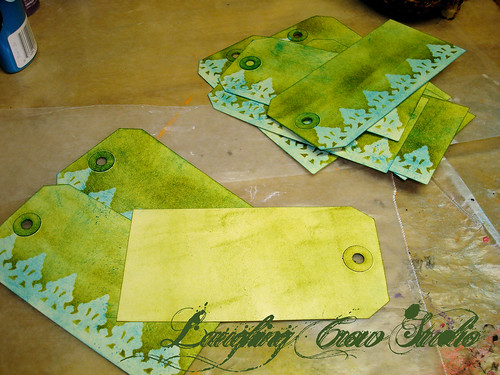
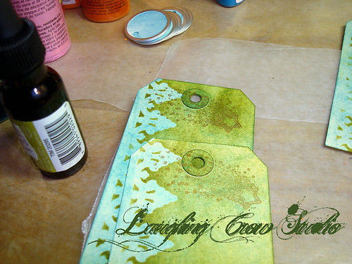
I started by using the applicator to put a background coat of Broken China (blue) on each tag. Next, I used one of the Tim Holtz masks along the left border and applied a coat of Peeled Paint (green) with the applicator. I turned each card over and lightly covered the back. I really hate raw surfaces in my projects.
As you can see, I went through a learning curve with the ink and applicator. After a few tags, I figured out that rubbing the applicator over the ink pad and then rubbing it over the tag gives the best color coat without applicator sized blotches. That's what I love about my art right now, I'm starting to master tools because I'm using them more often.
I added a shooting star stamp across the top of the tag over the hole. I tried using silver because I thought it would go nicely with the aluminum ring around the circle tag, but in the end, I went with copper. The copper blends into the background colors and I liked that look better than the shiny look of the silver.

I started adding content from the bottom, starting with the year. I love the way this Fired Brick red contrasts with the cool blue green background.
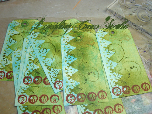
While playing around with the prototype, I decided that I wanted some sort of scrolling image in the middle of the tag, but subtle so it doesn't make it hard to read the quote. I tried several scrolls, but ended up with this one because it is light handed. I used the Pine Needles ink for this, which is more of an olive, yellow green. I love using adjacent colors on the color wheel like this because I love the richness it adds to the palette.

I used the Fired Brick again on the quote to make this the most prominent part of the design. It took a bit to figure out the placement for the stamp so I had the words in the best location. It was fun watching them suddenly appear nearly finished on the table.
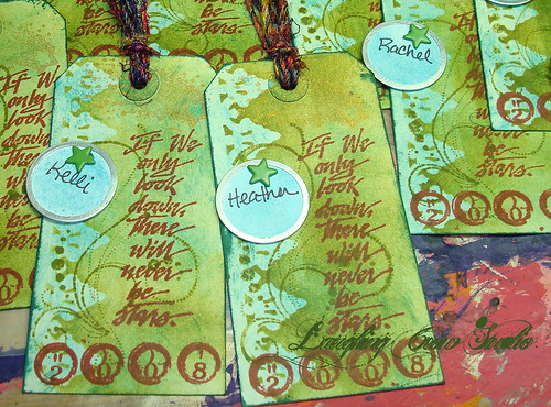
I finished up the inking by using Pine Needles on the edges and doing a bit of distressing on top and bottom. I love the distressed grunge feel it gives. I wrote the recipient names on the circle tags, and using a paper piercers, I punched a hole and inserted a star brad to attach the circle tag to the gift tag. I noticed that the circle repeats the scrolling design underneath, and love the way it lines up with the scrolls. I wish I could say I planned that, but in truth, it was a happy accident.
I cut the yarn and attached them to the tags. They are so pretty I keep one near me when I'm at the computer just to cheer me up!
More pictures on Flickr.
7 comments:
awesome! The tag is beautiful. Very cool, you know how much I like layers and texture. :)
really, really pretty! I especially am lovin' the colors!
thanks for posting.
The tags are gorgeous. i love the grunge/distressed look too. thanks for sharing how you did everything. i don't know about he Tim Holtz masks. What are they? I love that part on the edge.
Tyson: Yep, I know. You might not get this until I get back the way my days are going. I'll be in touch soon.
Brenda: Thanks. I love your work and I appreciate your kind support of my efforts.
ArtGirl8: Tim just came out with them, Heidi Swapp has had them for a while. There are clear, almost likc a stencil, with adhesive on the back so they stay temporarily in place. I inked the blue, set down the mask, and then added the green. The green went everywhere except where the mask was. He has several of them, and I bought a couple of them! Each package has several small or one big mask.
Beautiful sentiment Jamie!
It's good to look up, YES!
Happy Holidays to you and yours!
Constance
These are really gorgeous. The depth of layering makes a big difference, with the scroll and the colors and the inks. I love them. They are presents in themselves.
Thanks, Chris and Constance. I'm totally inspired by the work of Tim Holtz. I love the way he layers things.
Post a Comment