Showing posts with label distress. Show all posts

Sunday, December 13, 2009

Presents! Presents! Presents!

I've been super busy the last few weeks making holiday presents for my family. I've got some pictures to share with you here.


One of my nephews is a sports nut, especially baseball. Not only does he play, but he coaches and umpires. His family makes an annual trip to Chicago to watch his favorite team, the Cubs, play in Wrigley Field. This is a concertina with plain pages so he can insert any pictures he wants, and I've assumed they will be related to baseball. In the back, I've created a photo holder envelope out of double side printed cardstock. That's the tab you see sticking up in the back.


The next project is for a niece who is a senior in high school this year. It's a coin envelope book with a magnet closure with lots of tags inside. This image is the top half of the book with details. I trimmed down the envelopes so a #5 shipping tag would fit inside nicely, and designed the book around the envelope size. There are three kinds of yarn sticking out of the top from the tags. I do like a lot of yarn frilly stuff.


Here's a view of the bottom details. I used the outside paper to make the simulated tape holding the pieces together. That's why they blend into the cover. I also stamped related bird images along the front of each envelope with coordinating birds stamped on the tags.


Here's a view of the envelopes and tags and their stamps. I used several colors of the Tim Holtz inks to distress the entire project at each phase. This was my first envelope book, and I was working out the engineering as I went. As a result, this project is more of a prototype for future envelope book. I'm really pleased with how the magnet closures work, but next time, I'll hide them under the paper. I've got an idea for digging out some of the cardstock so it might even be flush with the surface. New ideas to try on future books.

Last year, I made this niece a book and filled up the pages with quotes that I thought she would enjoy. This book is blank so she can make her own mark on the world. I only hope that she really will use it! After seeing my handwritten quotes last year, perhaps she won't be afraid to write in this one.


This is the project I'm most excited to share. My oldest nephew got engaged about a week ago, so this is their first Christmas together as soon-to-be-newlyweds. I wanted to give my future niece-in-law a gift to help her mark this stage of her life's journey. It's a lunchbag book designed to collect information about their holiday traditions as a couple. Each two-page spread covered a different aspect of the holidays where she can record details and tuck away mementors, including:
  • holiday decorations
  • special events they attend
  • favorite holiday music (with a place to put in a CD)
  • Christmas eve events
  • Christmas day events
  • favorite recipes (with a deck of recipe cards)
  • special memories
  • holiday magic


I love the juxtaposition of such precious memories into such a routine object that seems to be temporary. I constructed the individual bag pages and only sewed the segment together at the end. I was planning to tie a narrow wire-rimmed red ribbon along the spine, but now that the book is finished, that seems like too much frilly stuff. I selected the papers from my stash and matched them to the recipe cards I found at Hobby Lobby.

{Note: I've added a few more pictures of the Holiday Traditions book. Click on any picture to view a larger version of the photo and see more details.]


The bottom of the lunch bag makes a natural flap on some pages. This spread gives her room to write in their holiday decorating traditions. And the facing page allows her to add a photograph.


This spread allows her to record the names of their favorite holiday music. Because my nephew is a band director, I'm sure music will be a part of their lives. On the right page, I've added an image cut from a Christmas card I received years ago. Behind that image is the lunch bag top, so the can slide in a CD of their favorite holiday songs to really record the memories.


This spread has the bottom of the bag on the left page. She can write on these pages things like their Christmas morning menu, or put in pictures. I've created a recipe holder by punching holes into recipe cards and inserting a book ring to hold them together. I'll slide the recipe cards in between these pages.

Saturday, December 20, 2008

San Francisco Travel Memory Book


I'm too tired tonight to start the next project, so I decided I would blog this one and then hit the bed. I've already triaged my holiday gifts, and I'm going to call people tomorrow and explain that I don't have their gift done, but will finish it after I return to Phoenix. I'm sorry it has come to that, but I won't drive myself crazy to finish projects when I know people won't mind at all.

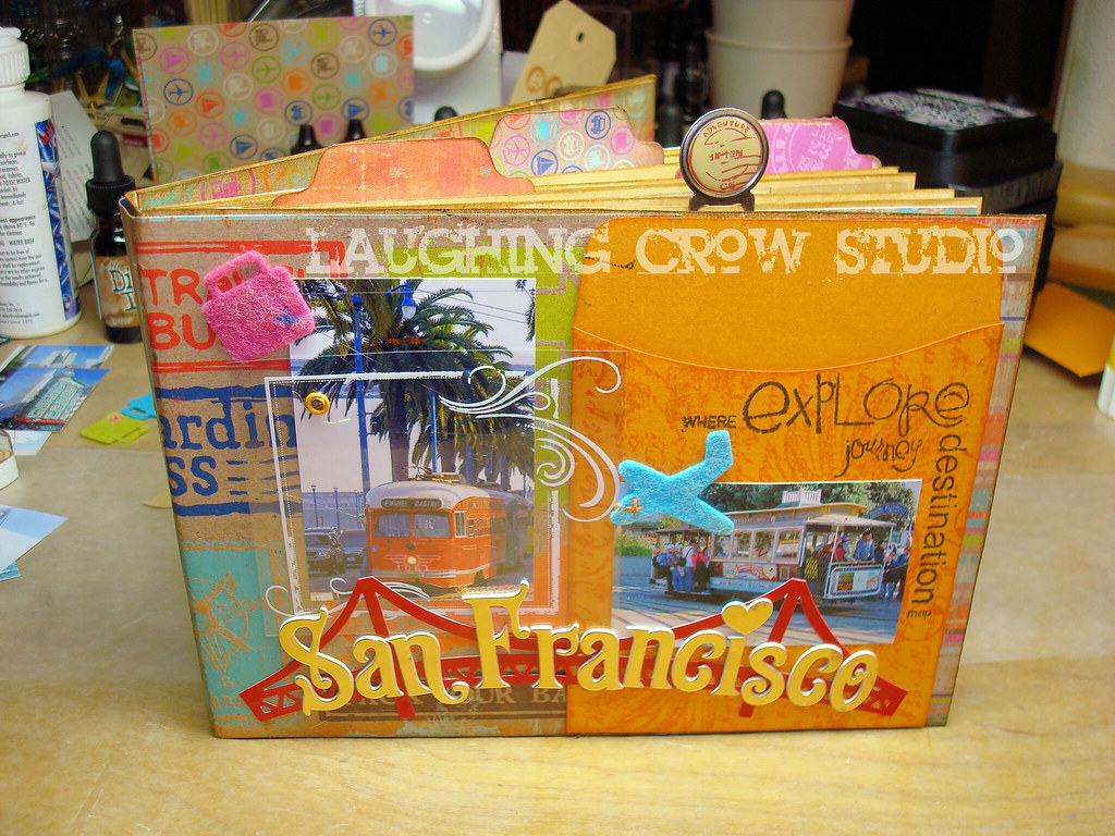
So, here is the second finished holiday gift for my family. This one is for my sister. She visited San Francisco this year, and hasn't done anything with her photos. I've made this book using a combination of travel guide pages, scrapbook papers, and photographs (reduced in size to act as embellishments). She can add 12 of her favorite pictures into this book.


This book doesn't have much dimension on the cover, but I did add a few layers. Notice the screen over the cable car picture (white scroll box) attached with an eyelet. I'm going to make a tag book to go inside the library pocket on the right (Bazzill).


As usual, I've added tags and tabs and clips along the outer edges of the pages along the top and side. I love the way this adds dimension to the book. I really love the grungy, distressed character of the paper, and have used the Tim Holtz distress inks to add to that feeling. The brown is Brushed Corduroy, and I've used it everywhere. I used a stamp to make the tabs out of the remnants of the scrapbook paper series.


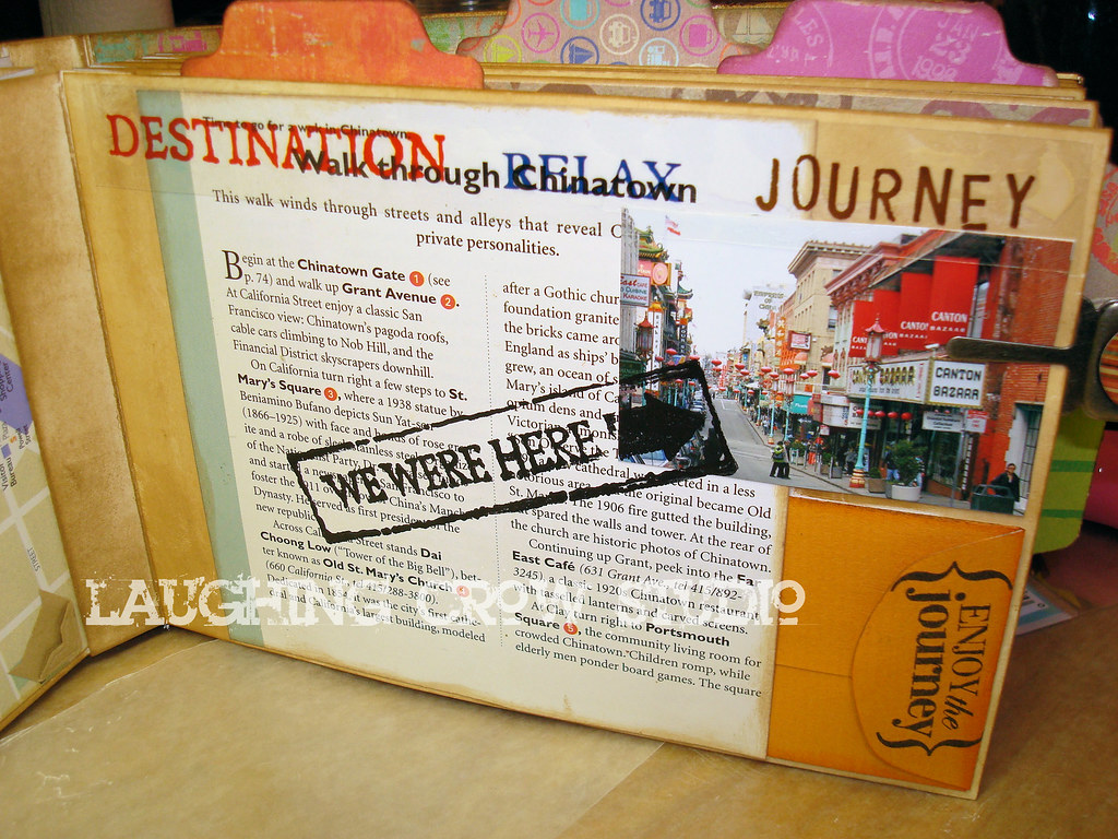
Here's a page based on a travel guide page. I've used the description of Chinatown along with a reduced photograph from Chinatown, and added a small coin envelope (Bazzill) so she can tuck away a small treasure or two. I used Stazon ink to stamp over the glossy travel guide page and photograph.

There are more pictures on Flickr.

Thursday, December 18, 2008

Holiday Gift Tags


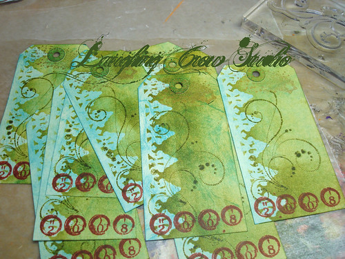
I'm so excited to share these with you! These are my holiday gift tags this year. I normally make nice tags, but I decided to go all out this year. This is my first holidays with my studio, and it is the best present I have ever given myself! Here's some of the back story on how I made these tags.

[Ooopps. I guess Jamie and Tyson now know they are getting something from me! Maybe I should have posted a spoiler alert.]

First, I pulled out everything I could think of related to a holiday theme from my stamp collection. I ended up going with a star theme because I have a nice star quote stamp. It speaks to the holidays without specifically being about Christmas or any specific holiday.

Then, I spent about an hour designing and mocking up a tag. I focused on placement and layout, and once I had it the way I liked it, I started thinking about the colors. My inspiration for the colors was a ball of recycled silk yarn from Tibet. I love this stuff, and want to use it where it has a big impact. I pulled colors from this to select which of my Tim Holtz Distress inks I would use. Because I love green and all shades of blue-green, that's my main color. The red really contrasts nicely with the coolness of the blues and greens. I wasn't thinking Christmas when I picked this scheme, but it works.


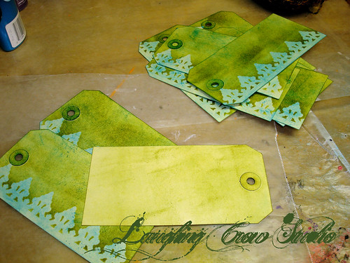
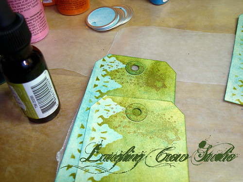
I started by using the applicator to put a background coat of Broken China (blue) on each tag. Next, I used one of the Tim Holtz masks along the left border and applied a coat of Peeled Paint (green) with the applicator. I turned each card over and lightly covered the back. I really hate raw surfaces in my projects.

As you can see, I went through a learning curve with the ink and applicator. After a few tags, I figured out that rubbing the applicator over the ink pad and then rubbing it over the tag gives the best color coat without applicator sized blotches. That's what I love about my art right now, I'm starting to master tools because I'm using them more often.


I added a shooting star stamp across the top of the tag over the hole. I tried using silver because I thought it would go nicely with the aluminum ring around the circle tag, but in the end, I went with copper. The copper blends into the background colors and I liked that look better than the shiny look of the silver.


I started adding content from the bottom, starting with the year. I love the way this Fired Brick red contrasts with the cool blue green background.


While playing around with the prototype, I decided that I wanted some sort of scrolling image in the middle of the tag, but subtle so it doesn't make it hard to read the quote. I tried several scrolls, but ended up with this one because it is light handed. I used the Pine Needles ink for this, which is more of an olive, yellow green. I love using adjacent colors on the color wheel like this because I love the richness it adds to the palette.


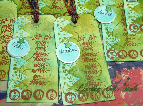
I used the Fired Brick again on the quote to make this the most prominent part of the design. It took a bit to figure out the placement for the stamp so I had the words in the best location. It was fun watching them suddenly appear nearly finished on the table.


I finished up the inking by using Pine Needles on the edges and doing a bit of distressing on top and bottom. I love the distressed grunge feel it gives. I wrote the recipient names on the circle tags, and using a paper piercers, I punched a hole and inserted a star brad to attach the circle tag to the gift tag. I noticed that the circle repeats the scrolling design underneath, and love the way it lines up with the scrolls. I wish I could say I planned that, but in truth, it was a happy accident.

I cut the yarn and attached them to the tags. They are so pretty I keep one near me when I'm at the computer just to cheer me up!

More pictures on Flickr.

Saturday, May 24, 2008

Project: Tim Holtz Distress-a-polusa

[Note: I've updated the photo using my new Sony Cyber-shot DSC-W80]

I just got home from a fabulous class with Tim Holtz at Scrapbooks, Etc. I took a quick picture of my finished project with my cell phone, but it does no justice to the project. I'll retake the photo after I replace my digital camera.

The purpose of the class was to experiment with the distress product lines. And who better than Tim to teach them! The class was full, I heard there were 40 attendees and a waiting list. I went in with high expectations, and the class exceeded them all.

First, Tim is great. He's down-to-earth, a guy who is living his passion in life. His passion is contagious. His teaching style is laid back, and he knows how to plan a class. It's the first project I've ever finished in a class! He totally tells you to do anything, do random things, and not to overthink it all. He's friendly and accessible. And did I mention that his projects totally rock! If you ever get a chance to take a class with Tim, do it.

The project is based on a 10" IKEA mirror, just like the one on my studio worktable for the wedding project. We were given a series of chipboard pieces and acrylic shapes from his Fragements line. We distressed each one, and they got glued to the mirror in a patchwork pattern. Then, we attached bits of found objects to the tops of them.

The heart of the project is the chipboard pieces. They fell into three groups for distressing.

1) We used crackle paint on the largest pieces. When the crackle dried, we used distress inks over the top. The crackle colors were a bit too pure for my liking, so I was thrilled to see how totally the colors changed with the addition of a layer of ink. It's not so much the color of the ink that changed the crackle paint, it was the texture of the ink that changed the texture of the crackle paint more than the color impact. I wish my photo showed that kind of detail. All I can say is you have to try these paints and ink over them, even if you use the same color ink.

2) We used embossing powder on the smallest pieces. The distress embossing powder is different from regular powders because it has grains that are supposed to fall away to give the distressed look. So the color after embossing is splotchy. We next inked over these, and again, the ink changed the entire look of the pieces. It filled in the distressed splotches.

3) We inked the remaining pieces, and then used black archival ink to stamp on them. We didn't use the distress inks for this because the products would have blended together instead of giving a sharp black stamp image.

We next created the acrylic squares by gluing them to pieces of paper from Tim's discontinued ephemera paper line.

Once all of the pieces were crafted, we arranged them around the mirror using a template Tim gave us. We tweaked the placement by swapping out pieces of the same size and shape until we liked the layout. Next, we selected from the bag of found object goodies the items we wanted on the pieces, and arranged them around the mirror. This was a blast. The goodies included things like a game board spinner, a small lightbulb, pressed tin crown, game pieces, and a button Tim made to hand out to the class attendees, among other things.

As much fun as I had all of the way through, I thoroughly enjoyed gluing down the individual pieces. We used a Ranger product (I don't remember the name) but it is clear and dried very quickly.

It was fun to see what everyone else created. We had the same materials available to us, and they all look so different! I had Tim sign the back of mine, too! I can't wait to hang it up in the studio.